I recently spoke with Dee Schlotter, who as senior color marketing manager for paint company PPG researches trends related to colors as well as how certain hues affect our moods. Dee explains that “design and decor are no longer office luxuries, but rather an essential extension of company culture that helps indicate the compatibility of talent to environment.” In other words, feng shui is not a load of malarkey. Paint colors and the decor around you can impact your energy and creativity when you seriously need to work. Dee and I discussed this in further detail below:
SHW: Are there any colors that increase our productivity whether in a home office or corporate work space?
DS: When decorating your office environment to increase efficiency, it is important to first determine the type of productivity that you desire to achieve. For example, a collaborative work environment that encourages conversation should offer a different aesthetic than an office setting that emphasizes concentration.
For workrooms and other areas where communication and chatter are encouraged, keep in mind the following:
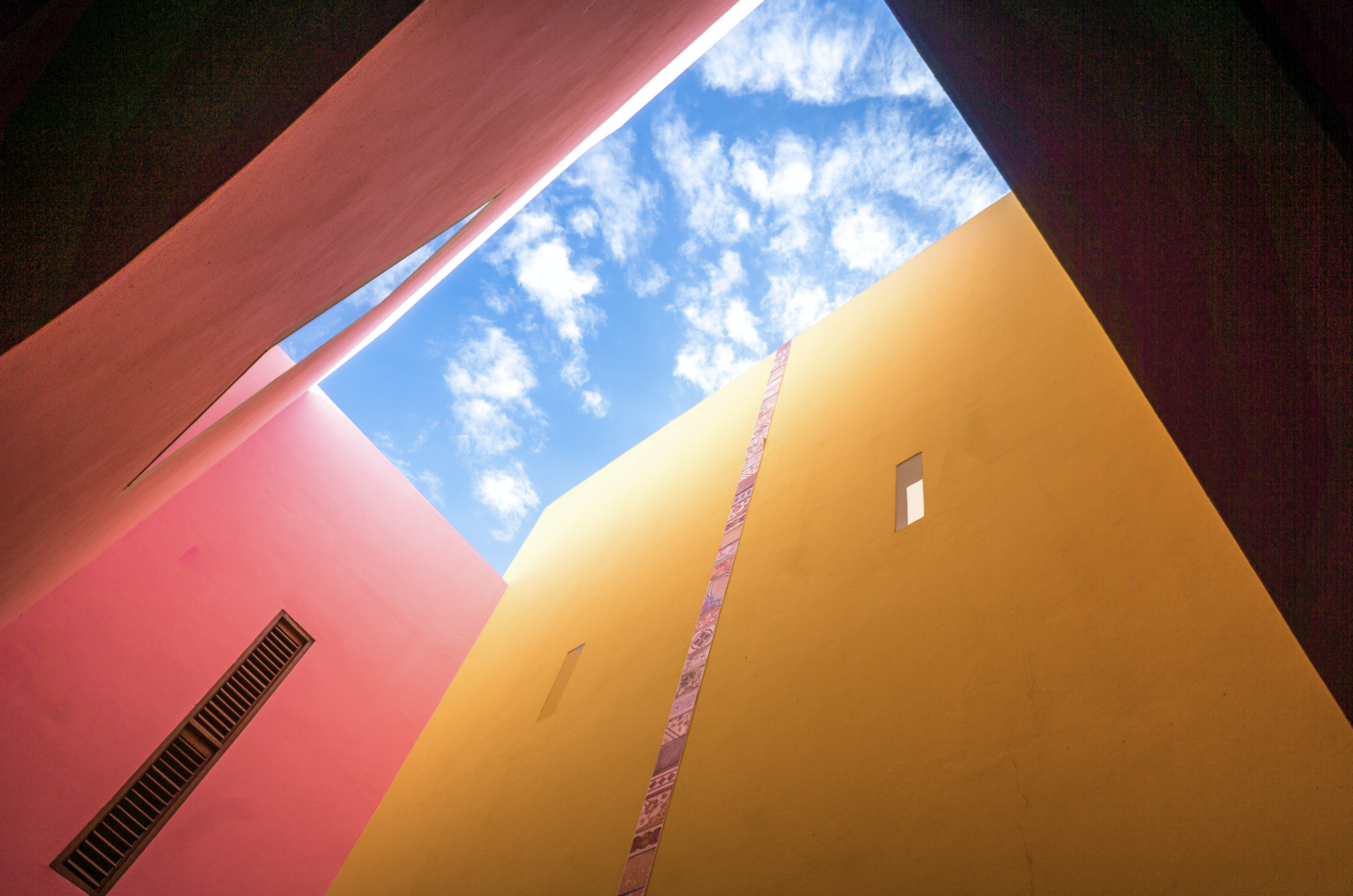
· Fresh and muted oranges (or a peach paint like we offer at PPG) are ideal for these types of workrooms.
· Adding an accent wall can create visual interest, energy and can add to creativity, however it can also divert attention.
· Hallways, corridors, stairwells, cafeterias, lobbies and common use areas are excellent places for color to create a sense of welcome, adventure, destination and enthusiasm. They are also great places to convey the office’s brand.
For work-spaces that allow focus and clarity of thought, consider the following:
· Creamy neutrals such as OLYMPIC® Paint’s Creamy White (OL695.1) are more suited for rooms where independent work should be the focus.
· Less disruptive color schemes tend to allow focus and clarity of thought, especially in a very cluttered world of constant interruptions. To achieve this type of space, try using the same color for walls, trim, even doors.
· More and more companies are harnessing the power of mindfulness and calmness. This leads to spaces for sensorial “underloading,” and we are seeing more serenity build into the design and decor of offices.
We are experiencing a few other trends in office design, including the following:
· Modern, rounded forms and subtle surface textures imply padding or pillowy softness, even if there isn’t much of either.
· Brown grays and/or green grays used with whites and gray-washed wood stains offer a gentle, calming ambiance. The occasional black framed window, chair or slim-line table provides just the right amount of structure or weight to the look.
· As more and more studies indicate the exceptional benefits of plants in the working environment, more companies are looking to get quite creative with their blending of man-made and natural worlds, using not just greenery, but color and material to help translate a more organic experience at work. Employees have the sense that the more inspiring their environment, the happier they are to be in it.
· Plant-filled offices are no longer just for up-starts trying to fill empty space. Even corporations can become more earth-minded by incorporating more organic elements into every aspect of design — from interior architecture to furnishings to palettes. Twilight greens and blues along with black add an interest not typical of nature-oriented design palettes.
· Whites and blacks are staples for tech startups, but the new tech workplace thrives on an organic-centric palette of saturated vegetable tones and twilight darks that hint at an ambiance of abundance and generosity and easy communicative exchange. Wood accents are essential, as are fluid, natural forms.
SHW: Which colors help us keep more alert and focused?
DS: Orange is a vibrant, energetic and outgoing color that stimulates your senses and spurs creativity. While red is also an active color, orange offers the same attention grabbing effect, but with a friendlier and more inviting tone that promotes an energetic environment that is not distracting or disruptive. There are shades of paint that are toned down versions of orange — they are invigorating, but are more modern versions of the clean oranges we saw years ago. Do keep in mind, oranges (and red) can also stimulate appetite!
SHW: Which colors make us drowsy?
DS: Blues promote peacefulness and create a tranquil environment that can often induce sleepiness, but you can energize your typical blue paint color by shifting the tone to a slightly aqua hue. With the addition of green undertones, blues become energized, happier and less serious. PPG Paints Acapulco Cliffs (PPG1150–5), is the perfect beautiful, bright aqua that inspires output while also promoting an environment of harmony and balance.
On one hand, it’s well documented that our working environments continue to become increasingly domesticated. For instance, the seating is more casual, the sense of hierarchy of offices somewhat disappears, and informal living room-type set ups are seen as a new style of conference room.
On the other hand, it’s well overlooked that none of those shifts would be as pleasant or as effective in breeding creativity and employee satisfaction if they were void of compelling design. A boring living room is still a boring living room at the office. An ugly environment with casual seating is just as energy-killing as one with regular office seating.
SHW: How do the colors of your office affect those who come in to meet with you? Specifically, Interviewees and being at ease versus feeling anxious?
DS: Subtle yellows have the ability to breathe life into a space and can convey a cheery, friendly environment to guests. Our favorite yellows are PPG Paints Joyful (PPG1105–2) and Cornsilk (PPG12–01).
Neutrals colors also create a classic yet bright aesthetic and promote a warm and welcoming feel. PPG Paints Morocco Sand (PPG1096–2), is the perfect creamy hue to create sensory ease and openness — but not being too unfinished looking. It is a warm and inviting color.
My office used to have a fuschia accent wall, PPG Paints Heart’s Content (PPG1050–6), with PPG Paints Moth Gray (PPG1024–4), a warm gray, on the other three walls. When I arrived in the morning, I would be energized by the fuschia pop of color, then sit and face the warm gray and less distracting color for work.
To connect with Dee Schlotter and get some insight on the hues best suited for your work space, go to www.ppgvoiceofcolor.com.
Originally published at medium.com