

The need to constantly optimize their site is one of the biggest challenges faced by anyone investing in mobile commerce.
But how can they not? Also referred to as mcommerce or m-commerce, mobile commerce is an advancement of ecommerce that enables people to buy and sell products from virtually anywhere by use of a mobile device. Basically, any monetary transaction that’s completed on a mobile device constitutes as mcommerce.
The convenience offered by mobile commerce is one of the main reasons why it has taken off so fast. Unlike ecommerce which, albeit convenient in it’s time, tied one to the desktop (you had to be home at your computer to conduct an online transaction), mcommerce gave consumers the freedom to buy whenever they wanted, producers a wider market and merchants a new field to play.
Forecast by eMarketer places the global ecommerce sales at over $4 trillion by 2020. Another study predicts mobile commerce sales to make up 54% of total ecommerce sales by 2021.
Apart from the convenience and the favorable growth potential, the other reason mcommerce is such a hit is that it offers a better overall shopping experience for the customer, at least it’s supposed to be (only 12% find it convenient to shop on mobile). Meaning, if you’re doing mcommerce the bar is already set. Providing a great customer experience on your mobile app, web page or Progressive Web App (PWA), is the least you can do.
Unfortunately, this is where many businesses fail the most with 46% of the top 50 retailers still behind on creating a responsive mobile site — a clear indication that most online retailers just aren’t converting enough leads. Today we’ll look at five things you can do to ensure you stay ahead of the pack and when the mcommerce traffic comes you’re ready.
1. Design for Mobile
If more than half of ecommerce sales are expected to be done on mobile within the next couple of years, then isn’t it obvious that the mobile experience should be considered before desktop? This is why developers have been creating a mobile-first design and optimizing it for desktop and not the other way round like it had been until recently.
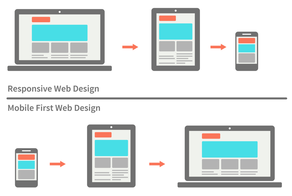
Difference between responsive and mobile-first web design. Source.
It’s mobile-first then optimize for desktop. Research from Google and BCG helps make this point. According to the findings, mobile influences more than 40% of the revenue for leading B2B organizations. Half of the search queries are made on smartphones and the number is expected to grow to 70% by 2020.
To provide a great customer experience and improve conversions, you have to get the design right from the start. As a general rule, emphasize on simplicity. Consider how you (of course you do some shopping online, you don’t live under a rock) would navigate your site if you were the shopper on the other end and run some tests to make sure you get better with time.
Here is a checklist of the design elements to pay particular attention to during the process.
2. Address the Security Concern
A simple way to increase conversions is to gain the trust of your customers. And nothing kills the mood like an unsafe environment. While more people are embracing mobile shopping, there’s a lot more fear in the air. A 2013 study reveals that nearly half of all online shoppers feel less secure just because they are shopping on a smartphone. Of course shopping on desktop doesn’t guarantee better security. But the consumer doesn’t know that.
To ensure this fear doesn’t affect your conversions, make your customers feel safer when transacting on your site. If you don’t have an SSL Certificate already, have one installed. That padlock on your toolbar it comes with shows shoppers that you take their security seriously. Be sure to show it off by displaying it as prominently as possible.
In case that doesn’t work, let them know they have the option of saving products and completing the transactions later on their desktop.
3. Make Use of Data
Just a few years ago, designs were created out of the designer’s experience, wants and intuitions. But today decisions are based on customer feedback and other information gathered from the users’ activities. With data, design teams can quickly make informed decisions regarding enhanced user experience, improved customer satisfaction and boosting the conversion rate.
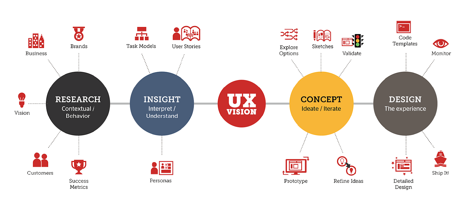
To realize the UX vision, data coming from different sources is analyzed. Source.
Data-driven design focuses on understanding daily user experiences and applying data in making design decisions. This data can be divided into quantitative and qualitative data. Quantitative data tells you what is happening while qualitative data tells you why it’s happening.
In a world where every last sector is data-driven, don’t be like Steve Jobs who famously said, “It’s really hard to design products by focus groups. A lot of times, people don’t know what they want until you show it to them.” Now you really have to consider what the people say they want.
4. Capitalize on the Visual Appeal
If we could only take just one thing from the success of photo sharing apps like Instagram and Snapchat it’d be that when it comes to mobile browsing, visual appeal is royalty. While the desktop allows you space to color your product with descriptions and CTAs, the mobile interface leaves you little room forcing you to focus on the photography.
Well, I say make the most of it. This is because online shoppers are highly influenced by the visual appeal of the product. It also helps to keep focus on the product. Here’s how two brands do it:
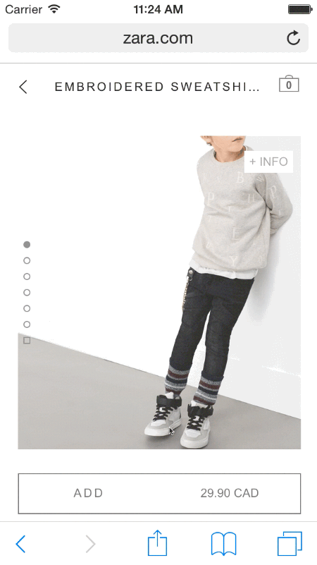
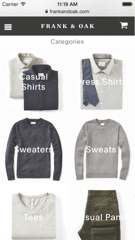
On the first, hiding text information helps keep the focus on the product. On the second, a simple grid of photographs minimizing the use of copy for the same purpose. Source.
To increase the conversion rate, product photography should be done well and prominently displayed on the page. Minimize the use of text to give maximum focus on your product. Here’s how to do it on a $50 budget.
5. Simplify the Checkout
One thing I haven’t mentioned is that online shoppers are an impatient lot. It’s easy to explain this because we can all relate. As a shopper, you don’t have time for long load times, unending forms or small text and images you have to pinch to view. You want it as seamless as possible.
When it’s anything short of this, you may even abandon your cart. In online shopping, this happens more often than you might think. More than 69% of shoppers reportedly abandon their carts during checkout. This really hurts conversions.
To minimize the cart abandonment rate, make sure your checkout is as simple as possible by offering more payment processes, expediting payments, designing intuitive forms and showing progression. Here are other tweaks you can apply to simplify your checkout and increase conversions.
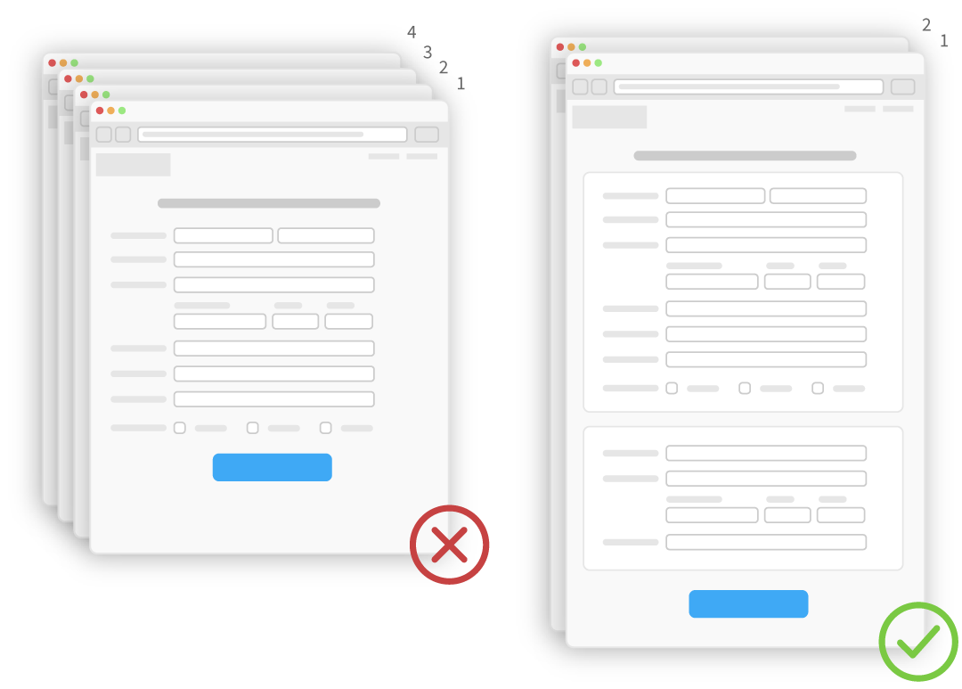
Collapsing a multi-page checkout into a single page or a few pages helps simplify the checkout. Source.
Mcommerce is not a Trend
Mcommerce is a result of the advancement of ecommerce. When it’s touted as “the next big thing” it sounds like a passing trend. But it’s far from one. It’s a self-sustaining industry that’s here to stay and will only progress, not die. That’s to say, retailers that wait for it to die down so they can go back to their comfortable lifestyle will lose more as time goes.