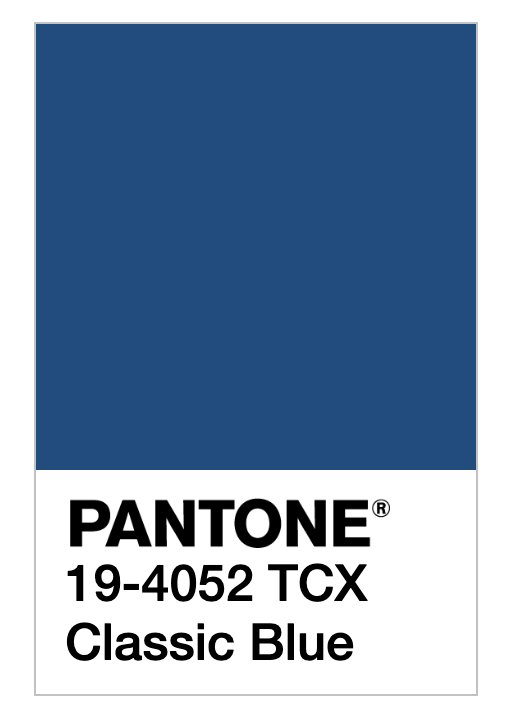
Each December for the past 20 years, the Pantone Color Institute has attempted to capture the zeitgeist in the form of its Color of the Year — which they’ve described as “a color snapshot of what we see taking place in our global culture that serves as an expression of a mood and an attitude,” according to The New York Times. This week, the company announced the 2020 Color of the Year — Classic Blue (19-4052), a shade they refer to as “a boundless blue evocative of the vast and infinite evening sky.” But writer Jane Larkworthy may have put it best at New York Magazine’s The Cut when she said, “It’s very soothing — anti-anxiety blue, if you will.”
In fact, comfort — “a reassuring presence” — is exactly the feeling that color analysts and forecasters at Pantone hoped to evoke. As Pantone’s V.P. Laurie Pressman told The Associated Press ahead of the reveal, “Many of us feel stressed, completely overloaded. We live these 24/7 lifestyles. We’re anxious. There’s so much uncertainty and unrest, no matter where you are.” Adding to that sentiment, Leatrice Eiseman, the executive director of the Pantone Color Institute, said in The New York Times that technology has “has sped things up to the point where we can’t necessarily handle all that’s coming in.”
Seeing “Anti-Anxiety Blue” make headlines this week, we at Thrive couldn’t help but nod along. After all, it seems like the thinking behind the color choice — reducing stress and finding ways to cope with modern life in a way that unlocks our full potential — is in line with the very principles Thrive was founded on. Three years ago, in announcing the launch of Thrive, CEO and founder Arianna Huffington wrote that “We are at an inflection point in history where technology has granted us powers that accelerate the speed of life beyond our capacity to cope. We’re more aware than ever that this way of living leaves us depleted, distracted and unfulfilled.” Thrive Global was born in response to the need to take control of our lives, offering new strategies and tools, based on the latest science, “to address the unintended consequences of these profound and invasive changes.”
Simply put, we’re all about solutions. And that’s why Pantone’s color choice is so reassuring. Attempting to capture what’s happening in life right now, they could’ve selected Pantone Rainy Day (13-5304), a moody light brown, or Pantone Dark Gull Gray (18-0403) — and who could’ve blamed them? But instead, we got a color of hope and optimism: Classic Blue — it “has depth to it, but it’s a color of anticipation because we’re looking ahead,” Pressman said. “What’s going to come?”
And while Pantone’s color of the year will undeniably (and intentionally) have an impact on marketing campaigns everywhere (get ready for blue everything — from bedroom walls to runway fashion), if it takes an explosion of cobalt to inspire more of us to re-prioritize our well-being and take refuge from the chaotic state of the world, we’re all for it. Lest we think that dramatic change isn’t possible, let’s just look at the evidence right in front of us: For centuries, generations had associated the color blue with sadness and melancholy; today, it has shifted to represent calm and hope. Perhaps that same shift — from a state of unrest to a state of thriving — is possible outside of a color lab, too.
Follow us here and subscribe here for all the latest news on how you can keep Thriving.
Stay up to date or catch-up on all our podcasts with Arianna Huffington here.


