
Use paint colours to draw attention
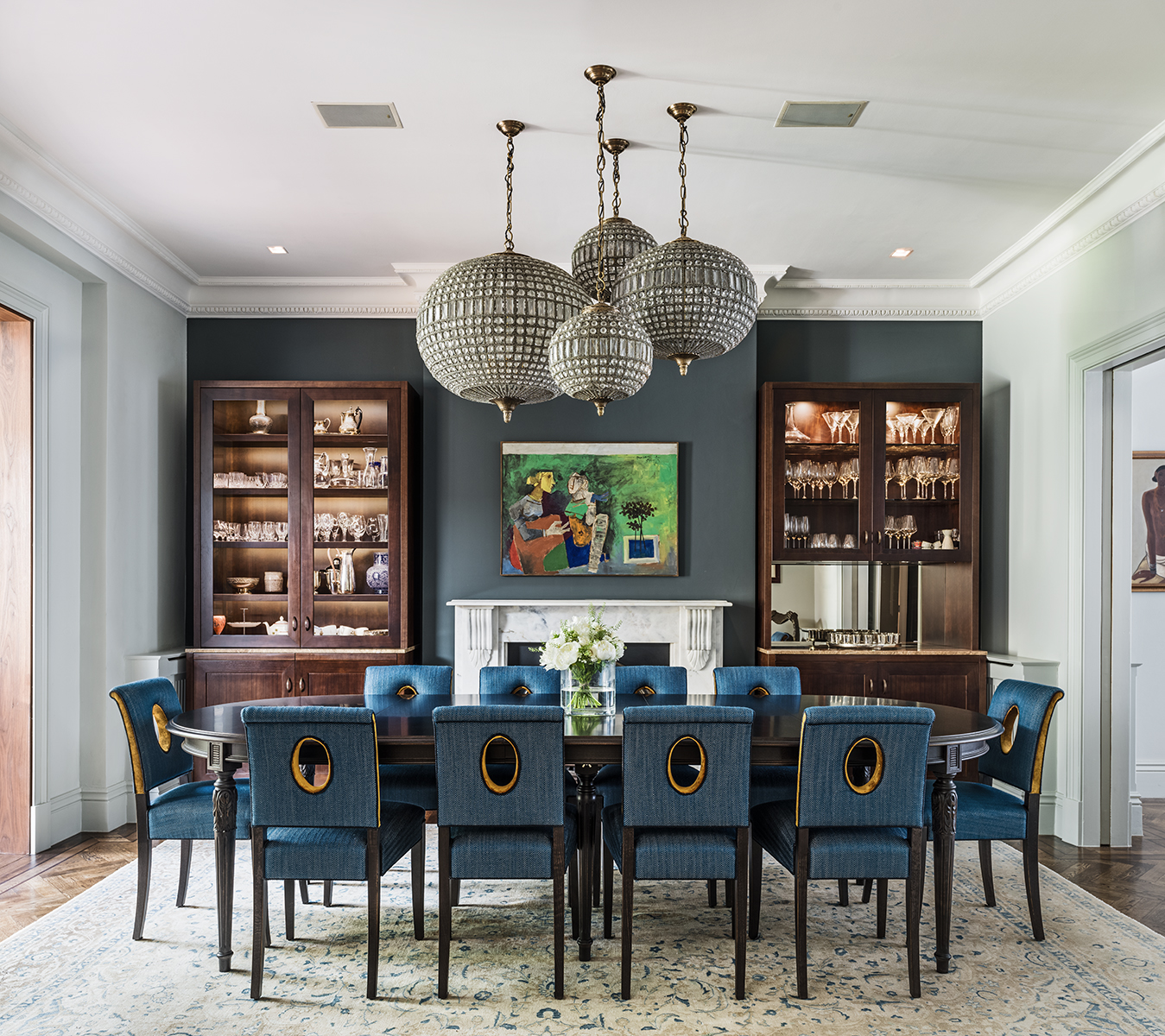
Using a different paint colour to signify a change in space is a simple way to change the tone of a room. This dining room opens into the reception room and the snug room. The same light green tone is used in the reception room so a deep blue hue is used on the main dining room wall to accentuate the space. It provides an accent, a punctuation in the flow, marking a change in the use of the space bringing a sense of occasion as you enter whilst adding sophistication and focus to the room.
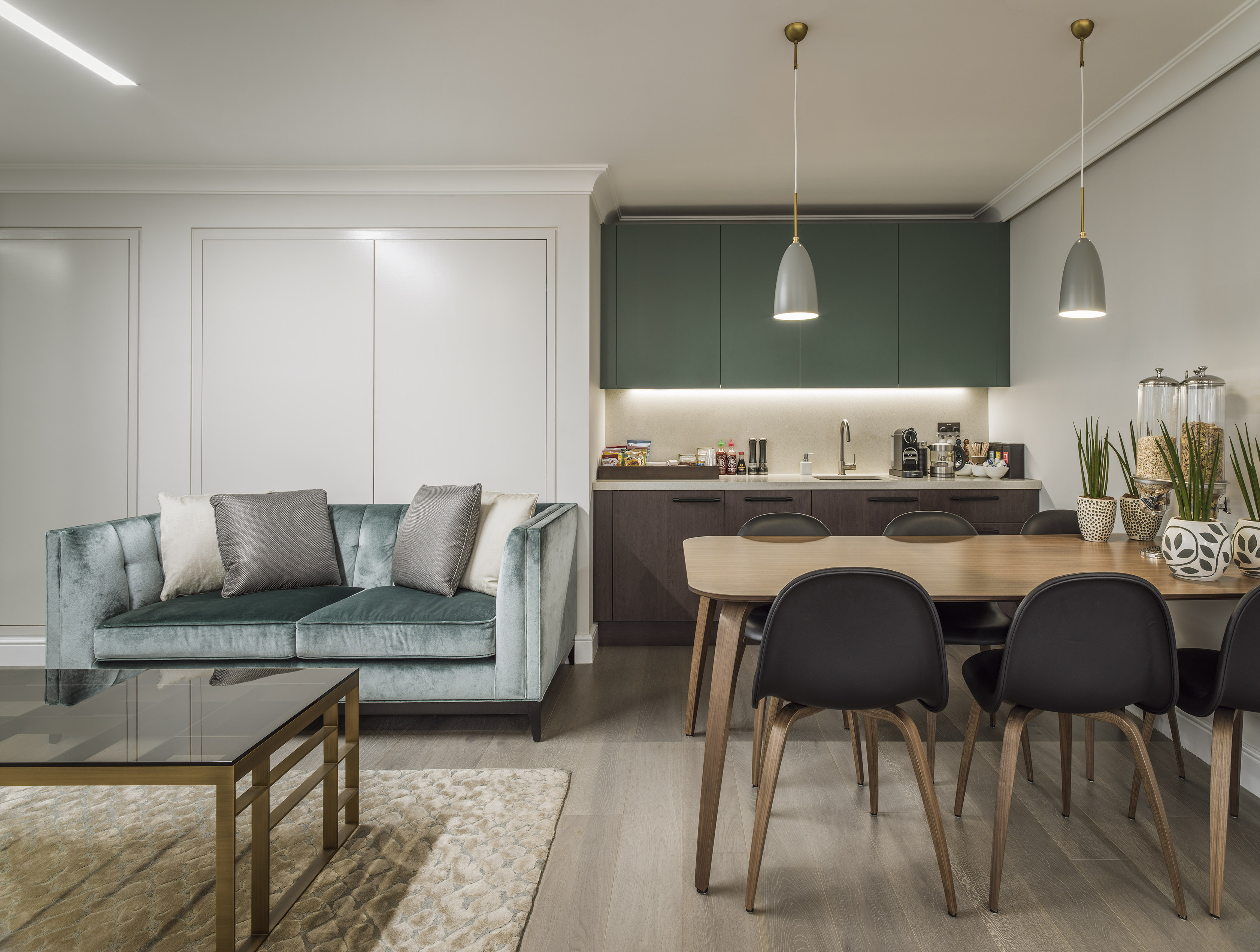
This office space uses green paintwork on cupboards to draw your attention to the kitchenette space, also providing a break in the neutral tones of the room.
Enliven a space by playing with its architectural detailing


Walking into a beautiful interior animates us, starts conversations and creates a positive environment to surround us. By looking at the architectural detailing of our interiors, we can take these elements as inspiration for decorating. The paintwork in these two rooms has merged the skirting/ mopboard into the wall with the paint colour rising upwards from this architectural detail. This adds design interest and frames the walls beautifully, creating striking scenery to inspire you. It is a good hack to use in a bedroom as when you wake up this paintwork will be in your eye line from the bed, sparking the start of your day. Using gloss paint, as seen in the photo with the blue paint, adds a reflective element to the space, helping bounce light around, rather than absorbing light as matt paint does.
Brighten basements with warm tones

Underground spaces don’t need to feel subterranean. Colour is so visually commanding and by choosing a bright colour a space can be uplifted, in turn uplifting people who spend time in it. This photo shows an interior that doesn’t feel like a basement space. The lack of windows isn’t evident as the power of the green tone creates a fresh setting. The ceiling is painted the same colour as the walls enveloping the space and the gold mural at the end draws your eye to the wall making a feature out of it. One excellent tip is to paint the skirting/ mop board the same colour as the walls to make them feel taller which is especially important in a basement space.

This basement bathroom is painted a warm glowing yellow bringing an invigorating feel to the space.
Create cosiness through natural materials

Natural materials have a warmth to them and add a level of textural detail that enriches a space. To make this bedroom extra cosy we used a timber print wallpaper on the walls around the bed. The reading lights make it into a snug reading nook as well. The warmth that is instilled through the cosiness of the timber style creates a setting perfect for winding down before bed or escaping when engrossed in a book. Using wallpaper instead of real timber is a much more economical way of getting a similar effect. This timber wallpaper is from Innovations USA
Go bold with metallics

This bright airy bedroom leads to a dressing room which we painted gold. The calming light tones of the bedroom take a metallic turn in the dressing room creating a moody space. This bright glamorous zone is a perfect setting for getting ready for an evening out. The whole dressing room is painted gold, with the door frame and ceiling included, inspiring you as soon as you enter. By keeping the wardrobe doors upholstered in cream leather they offset the gold ensuring it isn’t overwhelming as well as tying it into the bedroom space. It is a simple and cost-effective way to elevate the space illuminating it through the golden hue.
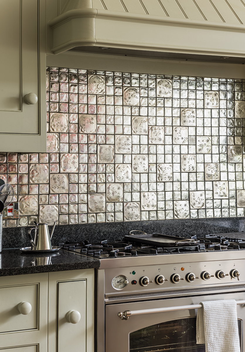
This silver tiled splashback provides a highly reflective surface reflecting light into the rest of the kitchen. Small areas of metallic tones can be achieved by using tiles as an alternative to paint.
Follow us here and subscribe here for all the latest news on how you can keep Thriving.
Stay up to date or catch-up on all our podcasts with Arianna Huffington here.