
Colours can have a great effect on how we feel, both positively and negatively. Naturally, we all want to enhance positivity and this can be done in an interior with some clever and simple ways. There are colours that are calming and that can apparently make you focus or even suppress your appetite. However, we all have individual responses to colour and we need to listen to this when we decide what colours to use in our homes. If a certain colour reminds you of a fantastic trip you took, you may want to include it in one of your rooms. Colour is seen because of light and light is energy. We all react to colours on an instinctive level, liking some and disliking others, even seeing colours in different ways to each other. When considering colour in our interiors we are bound to use those that we like as a starting point. In tandem with using colours that we find aesthetically pleasing, we can look at the emotional effects of them to inform our decisions. They are split into warm tones (reds and oranges) and cool tones (blues and greens) with many variations within them and tones in between. Warm colours are typically seen as stimulating and cool colours are seen as more restful.
The rhubarb colour in the photo above is painted inside a cupboard. Often interiors of cupboards are neglected as they are thought of as secondary spaces, merely storage areas, however to open the door and see a beautiful tone can provide a moment of delight. As designers, we treat every space with special attention and this cupboard is an uplifting space thanks to the colour used, rather than a plainly functional space for storage.
An oasis at home

The walk-in shower in this home is clad in aqua green mosaic. This colour evokes thoughts of lakes, oceans and landscapes. Green and blue tones are calming as they are the colours of water and the sky. Green prompts regeneration as it is literally a life giving colour; think of plants growing new shoots and leaves unfurling. Bathrooms are a space to prepare ourselves for the start of the day and to unwind at the end of the day. Creating a personal oasis in your bathroom can provide a pocket of privacy and self-care to recharge and restore in. By creating a setting with soothing tones through the colours of tiles and wall paint, a sense of calm can be encouraged.
Linking colours within a space

People can often be hesitant about using bright colours in their home for fear that they may go off them or find them too intense. Using bright or bold colours in small doses is a great way to incorporate them and add touches of surprise here and there. For this landing in a residential project we sourced a fridge in the same orange tone as the painting which creates a fun interplay between the two pieces and makes everyone smile as they reach this space on the staircase.
You can try this at home by picking a colour from a favourite painting or photograph and using it in your interior scheme through cushions, curtains, rugs and other accessories. This is also an economical way to use colour without committing to redecorating large areas.
Small pops of colour
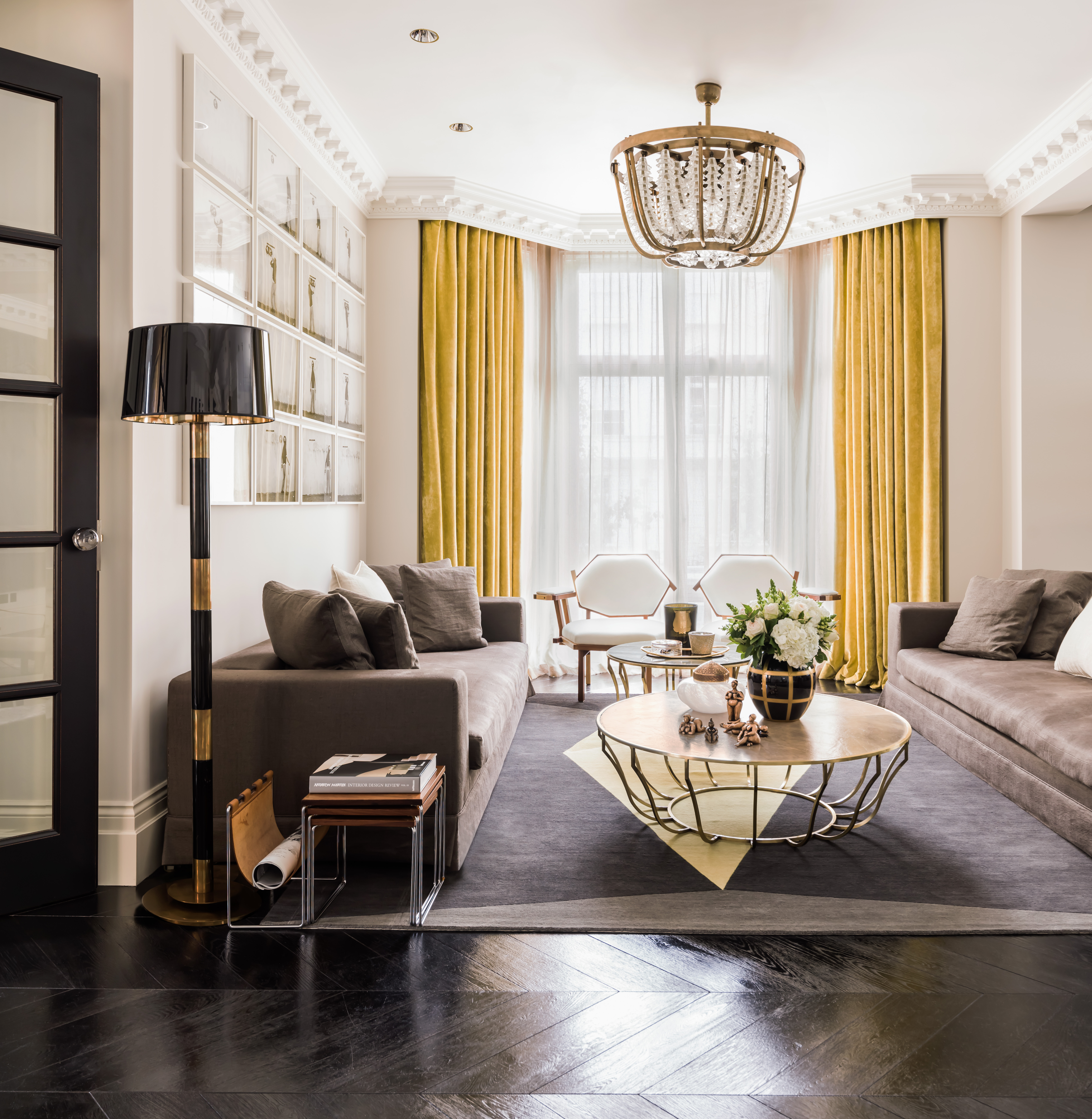
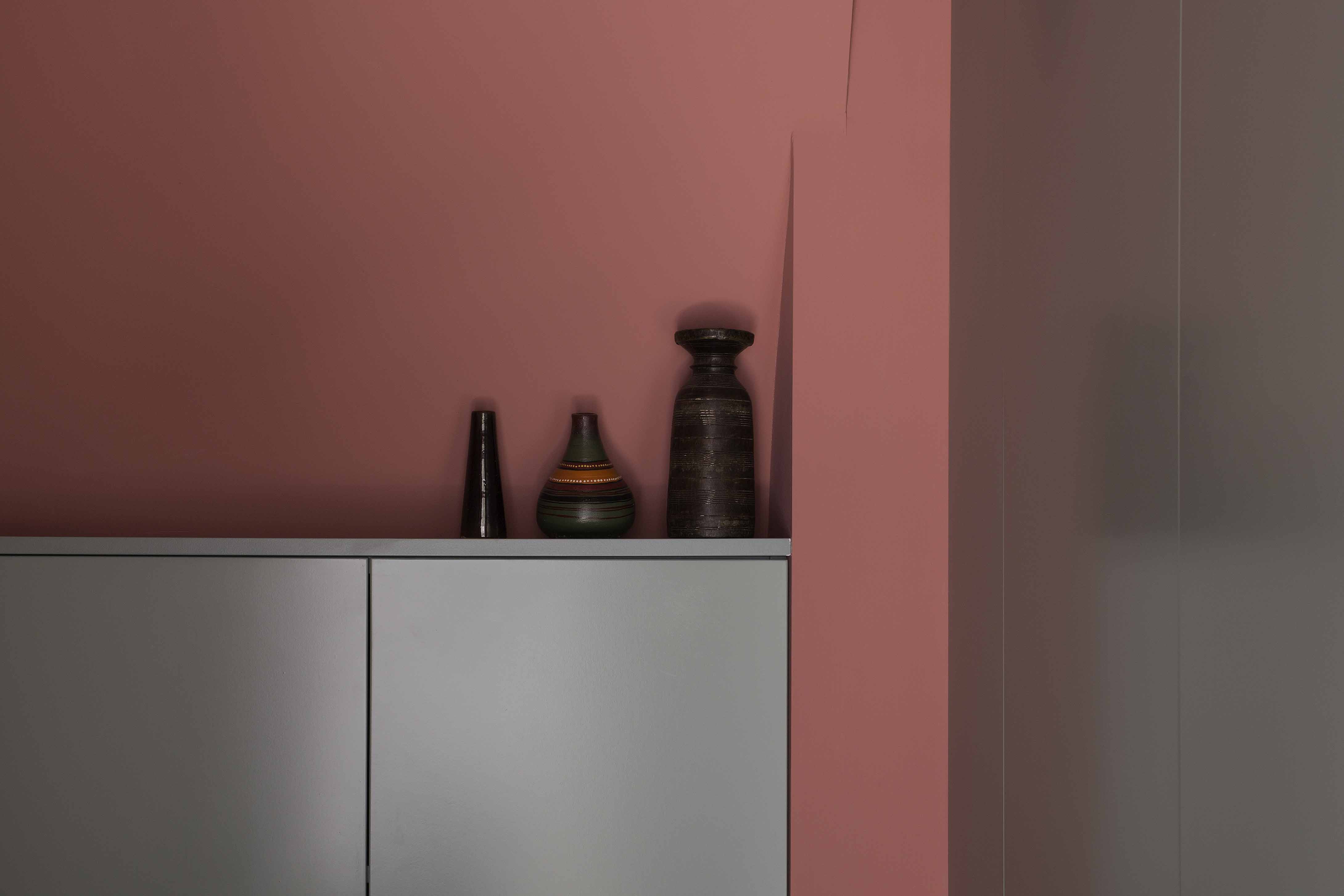
This house has a strong monochrome pallet with earthy tones. This pallet unifies all the spaces but every now and then there is a pop of a bright tone punctuating the flow accenting certain areas. The chartreuse colour of the curtains lifts the subtle earthy tones and draws your eyes to light from the windows. A similar colour was used in the diamond shape on the rug tying these colourful elements together. If you use the same tones throughout a home with no interruption of another tone it can feel bland and flat. It is best to give your eye something to surprise it.

This wall unit has a bold punch of orange separating two parts of it. It brightens an otherwise quite neutral space and draws your eye to it.
Soft calming tones to promote relaxation

This bedroom has a calming muted blue on the walls, evocative of the sky on a clear day. It creates a light space, perfect for winding down at the end of the day. The blue is bright, but not intense, which will maintain this bright aspect on days when there is limited sunshine creating an uplifting space no matter the weather.

Another calming look for a bedroom is this combination of soft taupe with light greens and blues. It is warm and subtle. Strong colours in bedrooms can create too much of an intense setting making it hard to wind down at the end of the day and too much of a bold awakening in the morning. Opting for soft, light and warm tones creates a soothing palette. Mixing the textures of these tones, by using them in the furniture and accessories, ties the pallet together.

The soft light green tone in this reception room creates a calming setting and provides a beautiful backdrop to the striking blue of the armchairs and other blue touches in the space. The dark blue on the armchairs, cushions and bottom of the curtains completes the colour composition creating a well put together space that feels organized and formal yet not intimidating.
Bright colours in small spaces

Often it is thought that bold colours are too much for a small space as they can feel overwhelming. This isn’t necessarily the case, especially if you use a bold colour on one wall only. This bathroom is painted a deep pinky red which elevates the muted tones around it. It enlivens the space making it fun and playful, rather than merely practical.
Using a single colour throughout


Using the same colour throughout an interior can create a seamless flow between the spaces. If you have a home with a complex layout, perhaps a series of small rooms or awkwardly shaped areas, by using one light bright colour in all areas you can make the space feel larger, more spacious and bright. It connects the spaces, bringing fluidity and calm. The soft grey seen here is a shade fractionally darker than white bringing a warmth to the walls and ceiling. The earthy and woody tones of the furniture create pockets of cosiness. Soft greys are calming and allow furniture, lighting and artwork to stand out, however bold greys can be draining due to the intensity of the tone.
Follow us here and subscribe here for all the latest news on how you can keep Thriving.
Stay up to date or catch-up on all our podcasts with Arianna Huffington here.