
Color psychology is one of the most important aspects to keep in mind when designing anything: from brands to everyday buildings. Colors influence us in many ways we don’t even realize.
We’ve grown to associate several colors with concepts, and they’ve become one of the first things we look for when searching for something. If you need a toy for your kids, you might look for pink or blue, depending on your kid’s gender. You might also look for a green and white sign if you need to find an exit.

When it comes to healthcare, you should be picturing some colors from that word alone. If you’re looking for a hospital, you will look for mostly white or pale colors like green and blue. The same is true if you try to imagine the interior and staff uniform.
Hospital color schemes play a big role in how we feel inside a healthcare facility. Today, we’ll learn why.
The psychological side of hospital color schemes
Colors are a vital aspect of communication. They can influence other people’s feelings, and just like with the exit sign example above, give instructions without having to say a word. The spectrum of emotions and concepts we can transmit with colors is huge.
Naturally, every color has its own connotations. Black is often seen as elegant, whereas yellow catches your attention quickly. We can learn a lot about why we see a color used in hospitals more often if we read about its psychological cues.
- Starting with white, we associate this color with purity, light, and perfection. Its use as one of the colors of health communicates safety and cleanliness.
- Yellow is warm and cheerful, and it’s common to see mustard tones in hospitals.
- Blue inspires several qualities we’d expect from healthcare. It’s personal, sympathetic, compassionate, sincere, and peaceful.
- Green is the last color we always see in a hospital. The main color of nature suggests harmony, freshness, and tranquility. It’s considered a calming color. That’s why green is among the relaxing colors for the office.
- Scrubs for healthcare personnel can also adopt several healthcare colors. It depends on what the hospital wants to communicate.
Furthermore, most colors used in hospitals are pale. While we tend to see these colors as dull and boring, it’s actually advantageous for hospitals. It lets them employ positive colors without overwhelming the patients’ senses with strong tones like yellow.
Specific uses of color in healthcare environments
Hospital color schemes vary extensively, and many factors play a big role when determining which colors to use.
The vital consideration is always the people exposed to the colors. According to the GetNursingEssay company, it’s important to consider the patients and the staff as well. They’ll spend more time inside the facilities overall than almost every patient.
However, we can’t ignore the patient. Naturally, it’s ideal for calming them but considering conditions like color blindness. Certain medical conditions that might alter color perception. That’s why different hospital rooms will have entirely different medical color schemes.
- Patient rooms must be calm, preferably with pale colors, to avoid saturating the patients’ senses. Bright colors could tire the patient, while others—like yellow—could disrupt their sleep and recovery.
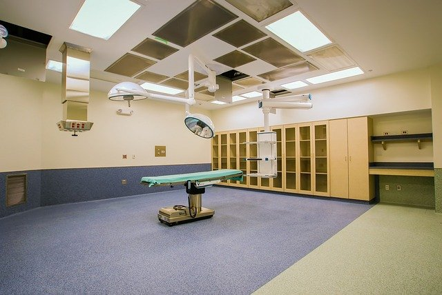
- Operating rooms should be either blue or green, perhaps a combination of both. That’s because doctors will see blood every day, and choosing the opposite color neutralizes red and alleviates stress.
- Pediatric rooms are almost contrary to patient rooms. These colors entertain and engage children, thus reducing anxiety and stress often caused by going to the doctor.
- Intensive care units also need to be relaxing, preferably using neutral colors with light colors.
- Examination rooms tend to be less stressful, yet they also benefit from calm colors. These don’t need to be as pale as patients or intensive care rooms. Hospital color schemes for examination rooms are more “home-like.” They tend to use brownish tones, especially for eye examinations.
- Dentist rooms need to be as calming as possible. It might sound silly, but people hate the dentist enough to earn an entire WebMD page. Therefore, these rooms often have calming green tones.
- Common areas like cafes, waiting rooms, and corridors should be energetic since people will usually spend long times here. Furthermore, corridors should use brighter colors to suggest the right routes.
- Treatment and physical therapy rooms should focus on blue. Among healthcare colors, blue is quite unique in that it reduces tension in the muscles. Energetic tones like oranges or yellows can also motivate patients.
Advantages of proper medical color schemes
When used properly, a color used in hospitals becomes an integral part of a patient’s treatment. They can help stay calm for accurate examination or make it easier to rest for better recovery.
Using healthcare colors effectively harnesses several benefits. They contribute to the quality of a hospital’s service and clients health.
For instance, colors help patients evaluate the care level of the hospital. Depending on the shades, it can help people feel acceptance or even trust. That’s not the only color though.
Brown, on the other hand, instils a homely sensation.
Colors can also help healthcare staff’s productivity. A reason why relaxing office colors are popular is that it’s easier for workers to remain focused that way. Using calming or energetic colors in a hospital can help different personnel adopt different mindsets.
However, the most impressive effects of hospital colors schemes relate to physical health. The colors used, you could lower or increase the heart rate, improve sleep quality, and motivate fatigued or exhausted patients.
5 reasons why the colors of health can make a big difference
Finally, let’s dive into the specific goals behind healthcare colors.
Color in healthcare environments has different effects on the people occupying the facilities. Now, it’s time to assess exactly how healthcare facilities utilize these colors. Most hospitals apply their psychological effects for patients’ benefits.
Feeling at home
Examination rooms, cafes, and some patient rooms tend to use yellow and brown colors. That’s why these colors exude a “homely” feeling. Even if you don’t use these colors in your house, these palettes help patients remain calm. However, it’s important not to use high contrasts to avoid strain.
Staff comfort
Healthcare staff has some of the longest and most stressful shifts in any industry. Medical color schemes can be a great aid to help them rest now and then to make sure they’re focused and comfortable. Both bright and dark rooms can help short and longer breaks depending on the staff’s needs.
Improving perception
Everyone can guess—with relative accuracy—how much blood surgeons and nurses see everyday. That means constant exposure to red tones in frantic days, and contrasting this color is necessary. Staring at red for too long causes afterimages: seeing blue and green spots on the walls. It happens more with white backgrounds, so green and blue are more common medical color schemes for these rooms.
Patient condition’s importance in a medical color scheme
There’s a huge difference between a children’s hospital and one for elderly patients. Children benefit from bright colors to make them feel happier. The elderly need calm colors and fewer pastel tones to help their eyesight. Dermatologists should also avoid colors that would blend with patients suffering from skin conditions.
There aren’t universal colors
While healthcare colors are easy to recognize, hospitals don’t follow a formula. Every room and space needs a different palette, tones, and saturation depending on the patients and staff that’s going to occupy it. Red can be detrimental for neurological patients. Some yellow tones could be nauseating for some, regardless of their calming properties.
Conclusion
Healthcare colors might feel like a waste of time in a place where the main focus is to save lives. However, lots of research has gone into color psychology, and every color used in hospitals can have a good or bad effect on the patients.
That’s why the medical color scheme is easy to recognize or imagine. These colors have proven to benefit both healthcare workers and patients. That’s why they’ve become a standard in almost every healthcare facility.
Today, we have amazing innovations. Stem cell treatment is revolutionizing healthcare. However, we shouldn’t forget about traditional approaches.